Expression
People in the light.
One light source in rose and apricot gel, a long-exposure ghost, and bokeh that falls into square pixels. The same treatment applies to every person we photograph.
Photography
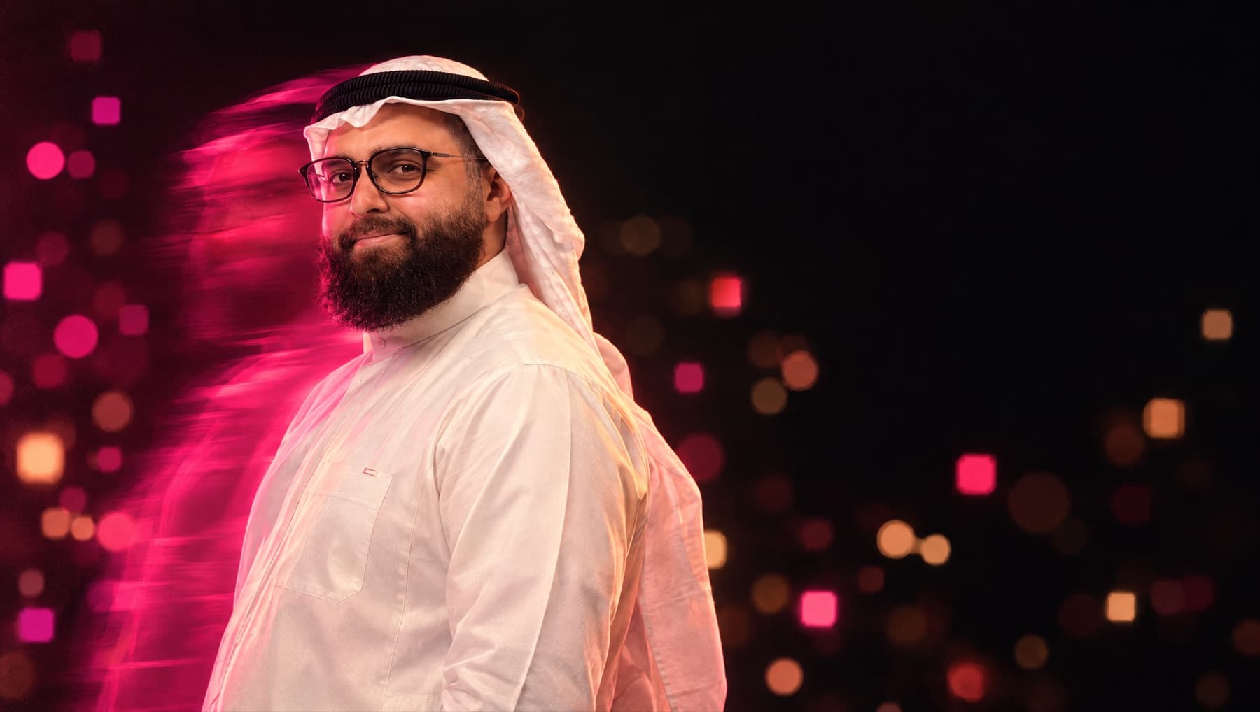
- One gel lightRose and apricot from one side, the rest of the frame falling to ink.
- Square bokehOut-of-focus light renders as pixel squares, echoing the symbol.
- Real work and real peopleFactories, stores, kitchens and the team. Generated images are approved by a person before they go public.
- No stock robots or glowing brainsNo blue circuit boards, humanoid robots or floating holograms.
Icons
Drawn on a 24-pixel grid, from pixelarticons by Gerrit Halfmann (MIT licence). One treatment per surface, never smaller than 16 px, never mixed with another icon set.
Manufacturingbuildings
Retailstore
Food and beveragecoffee
Agents and workflowsmessage-processing
Search over documentsfile-flash
Private models, your cloudserver
Running itsliders
Regionmap
No training on your datalock
Access by rolecard-id
Audit trailanalytics
A person approvesusers
Tested before launchshield
- Gradient tileInk glyph on a dusk tile. Feature icons and Instagram highlight covers.
- Line on inkBone glyph on ink. Navigation, product screens, dense lists.
- Gradient glyphThe glyph in dusk on ink. One per view, for the hero moment of a section.